* Product details and visuals have been generalized to respect organizational confidentiality.
TL;DR
I drove design system component improvements through two focused usability studies — on field states and bulk actions — turning implementation inconsistencies into pattern updates adopted across the internal system.
Overview
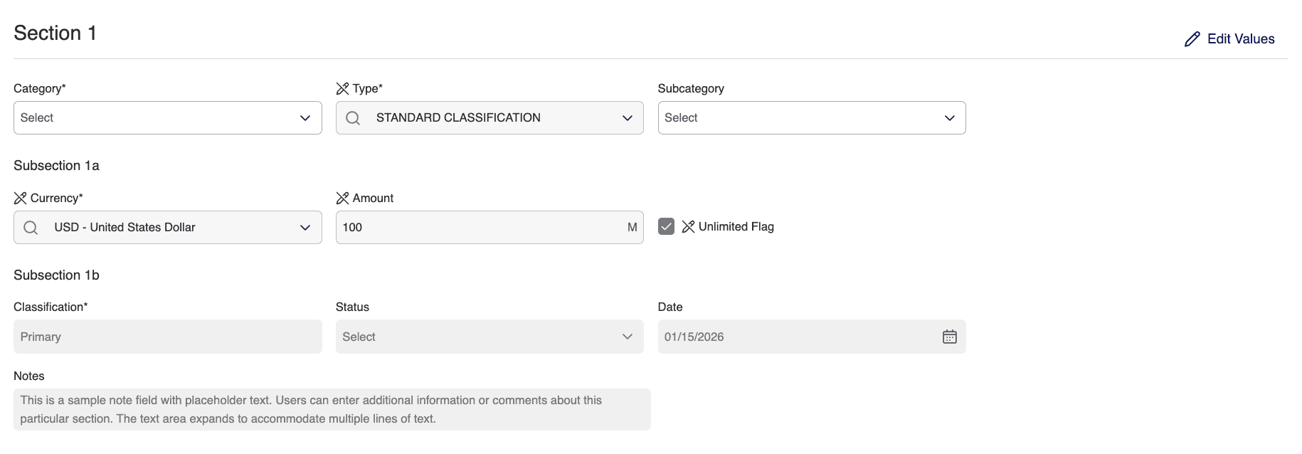
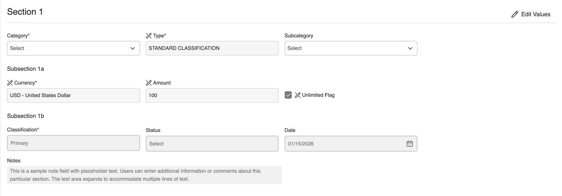
While designing internal enterprise tools, I noticed recurring inconsistencies in how shared design system components were implemented across products. In data-heavy environments, small visual ambiguities erode user confidence at scale. Rather than fix these issues locally, I partnered with the design system team to validate improvements through usability testing — two focused studies on field state clarity and bulk action interaction patterns, with the goal of strengthening reusable components across the ecosystem.
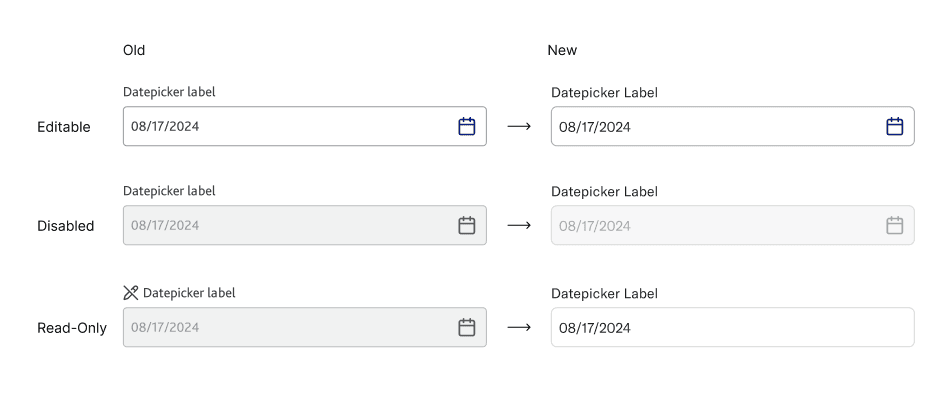
Field State Validation
Field states appear in nearly every workflow, but inconsistent treatment of background, border, and icon across products created confusion about whether a field was editable, read-only, or disabled. Because the component is reused widely, clarifying it would scale across multiple tools. I ran comparative interview testing on controlled visual variations to identify which signals users actually relied on.
Findings. Background color was the strongest signal. Subtle border differences were frequently overlooked. Adding edit icons sometimes introduced noise rather than clarity. Not all participants clearly distinguished read-only from disabled.
Design priorities
State differentiation clarity
Clearer visual distinction between editable, read-only, and disabled fields so users instantly understand what they can interact with.
Reduce icon clutter
Fewer, more purposeful icons so visual signals stay meaningful rather than overwhelming or repetitive.
Edit-mode clarity
A clearer way to enter and recognize the editable state, so users always know when changes are possible.
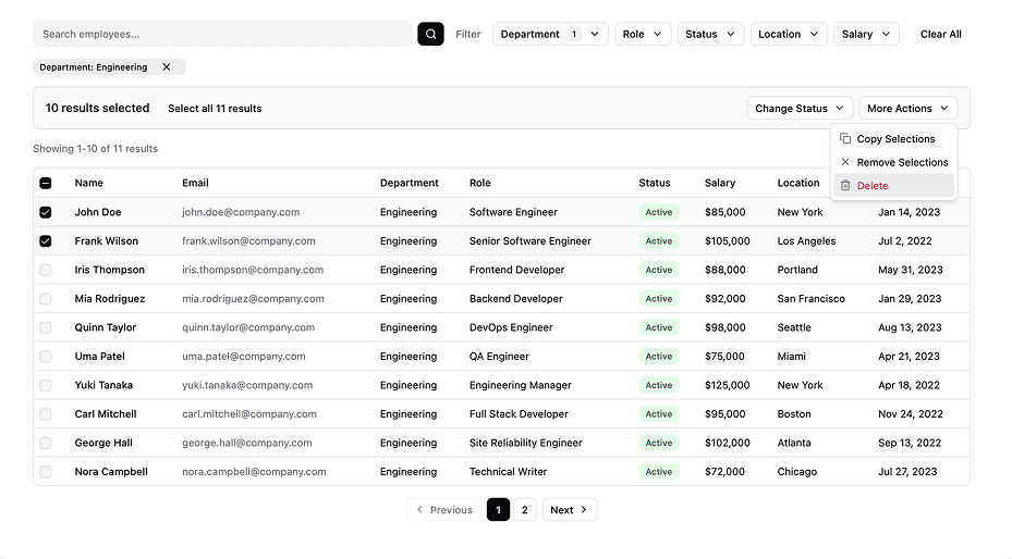
Bulk Action Pattern Testing
Bulk actions in data workflows carry operational risk — users have to understand what is selected, what scope applies, what action will occur, and whether recovery is possible. Unlike field-state perception, this required behavioral validation through realistic task execution, so I ran task-based usability testing on an interactive Figma prototype with eight participants.
Study · 8 participants · 3 tasks
Task A
0.0%
Step error rate
(0 errors / 8 × 3 steps)
Remove a single user by name and undo.
Validate clarity of single-item selection and undo behavior.
0 / 8 (0%) hit errors
Task B
9.4%
Step error rate
(3 errors / 8 × 4 steps)
Filter by department, select all on current page, change status, undo.
Validate multi-selection behavior and clarity of bulk selection scope.
3 / 8 (37.5%) hit errors
Task C
6.25%
Step error rate
(3 errors / 8 × 6 steps)
Apply multiple filters, update selection (select all), change status.
Evaluate how filter changes affect multi-selection and clarity of selection persistence.
3 / 8 (37.5%) hit errors
Step error rate = errors ÷ (participants × steps per task)
Findings. Selection scope wasn't always clearly understood. Filter state and selection state were often conflated. The presence of undo significantly increased execution confidence. Confirmation messaging needed stronger specificity.
Design priorities
Selection scope clarity
Make it explicit whether users selected items on the current page or across all results.
"Selected 10 of 50 results"
"All 50 results selected (across 5 pages)"
Strong post-action feedback
Clearly state what action was applied and to which items.
Distinct action bar design
Visually separate bulk actions from filters and table controls.